There are over 1.98 billion websites online today, each one trying to reel in its target users with superior design in line with SEO. But very few succeed in making it to the first page of Google search results.
If you are not among them, you need to ask yourself- What makes your website stand out and grab attention? If you don’t have a certain answer, it’s time you incorporate the latest website design elements into your site to achieve superior SERP rankings and conversions. Here’s a list of the most successful modern website design elements to help you get started!
The Top 10 Modern Website Design Elements
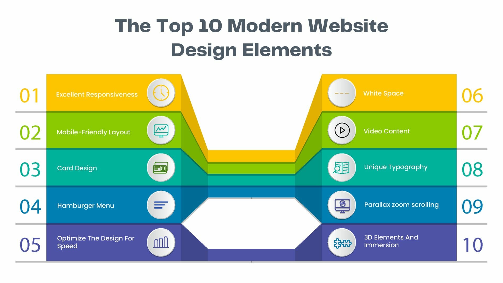
Incorporate these cutting-edge website design trends and elements to your site while building or upgrading it to make it outshine its competition and get the attention it deserves-
1. Excellent Responsiveness
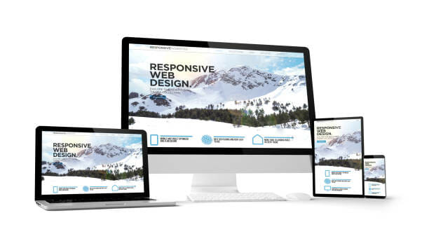
Responsiveness is critical for a website as over half the internet traffic comes from mobile devices, and users will likely leave your site if it is not fast and stable on all device types. Moreover, Google has also started to penalize websites that are not mobile-friendly based on their mobile-first policy.
So, you must analyze your users, finalize your domain, and then focus on building a responsive website that looks and works great on mobile, tablets, desktops, and laptops based on the expected usage. You can use responsiveness testing online tools to ensure that your website loads and adjusts quickly and perfectly to match all device types.
2. Mobile-Friendly Layout

While the responsiveness of a website makes sure that the website responds correctly to the lower or higher screen resolutions and size, a mobile-friendly layout focuses on optimizing the human experience through proper placements. A web developer must consider both factors to ensure that the resulting website is both responsive and mobile-friendly.
For example, a responsive website design will scale down the elements to match smaller screens. In contrast, a mobile-friendly design will include layout rearrangement and spacing of the page elements to allow a convenient experience on mobile devices.
While the trend of mobile-friendly website design has been around for a while, many websites still don’t look their best on their mobile devices, and you must change that to get an edge over your competitor sites.
3. Card Design
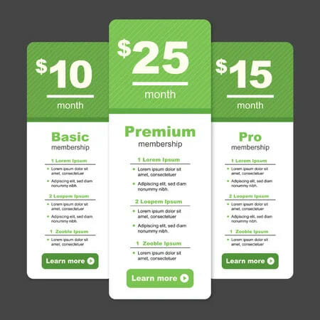
The use of cards allows you to distribute the site’s information so the visitors can easily view and consume bite-sized pieces of content without being overwhelmed by all the other content. At the same time, a card design keeps the homepage clean and organized.
By delivering easily digestible chunks of information for users and highlighting multiple products or solutions side-by-side, the card design ensures that users can quickly understand the site and make a choice to proceed further.
Naturally, these benefits culminate in a lower bounce rate and higher conversions. For the best results, the cards should be responsive. This means that the number and dimensions of cards should adapt based on the screen size.
4. Hamburger Menu
![]()
Most websites have lengthy menus with a ton of options to choose from. This is great because it can take visitors directly to where they want to go, but it also takes up a lot of valuable screen space.
That’s where the hidden or “hamburger” menu comes in. This compact hidden menu saves space and offers a user-friendly interface with a list of options when clicked on. But why is it called a hamburger menu, you may ask?
It’s actually pretty creative. The three lines stacked on top of each other in most designs look like two buns and a patty, just like a hamburger!
This menu provides a simple and clear path for users to navigate your website. And this leads to higher chances of users finding the information or options they need to complete their desired actions, raising your conversions.
5. Optimize The Design For Speed
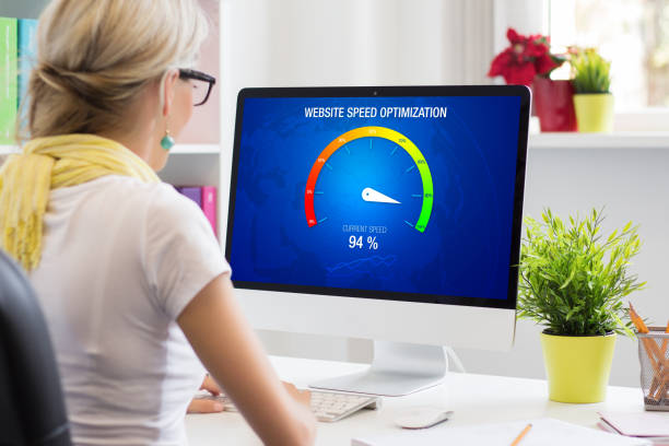
Having a website with compelling content won’t translate into conversions if it takes too long to load as visitors will get impatient and leave! So, it’s essential to optimize every aspect of your website for speed to ensure visitors stick to your site and don’t look elsewhere. You can take a few quick steps to achieve this-
- You need to balance image quality and file size. For example, while PNG images offer a high level of quality and transparency, they tend to be larger than JPEG images.
- In most cases, JPEGs offer the best compromise between speed and quality. On the other hand, GIFs are great for animated images, but they use fewer colors, making them less suitable for static images.
- Another important step is to compress the files hosted on your website, as modern compression tools can greatly reduce file size without sacrificing functionality.
- The type of hosting environment you choose also plays a key role in website speed optimization. You can prefer dedicated or VPS hosting for complex websites as they typically offer faster site loading speeds compared to shared hosting solutions.
- Also, check for any errors that are slowing down your website using diagnostics tools and correct them immediately.
This optimization is crucial because landing page speed is used by Google as a ranking factor for mobile searches and Google Ads. Moreover, Google has found that as page load times increase from 1 second to 10 seconds, the bounce rate increases by 123%.
Interestingly, despite the shift to faster internet connections, many websites still suffer from slow load times. As a result, even modest investments in website speed optimization can make you a preferred option and pay off big time!
6. White Space
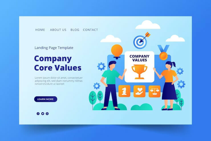
White space has become a crucial component of modern website frameworks that integrate simplicity, functionality, and aesthetics. It improves navigation by highlighting key elements and making it easier to locate your important promotional content, product pages, or contact information.
This makes it more likely that visitors will proceed with the conversion process instead of losing focus due to clutter. In this way, users are naturally drawn to the key elements of your site if you balance content with adequate white space.
For example, if you have a featured product image or video at the top of your homepage, using white space to separate it from other content will make it stand out and emphasize its significance.
While there isn’t a strict standard for the amount of white space needed, it’s a good idea to include appropriate white space between each content element.
7. Video Content
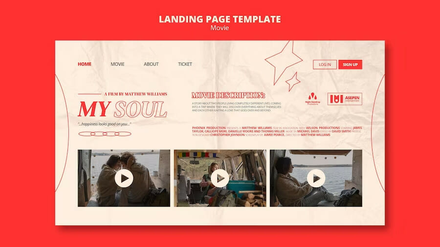
Did you know that adding a video explaining your product or service can raise your website traffic by 144% while also boosting your visitor retention and conversion rate?
Yes, video content can have exceptional benefits for your website due to its superior engaging power and improvements in SEO. Videos that automatically play in the background are especially great at adding a lot of intrigue to a page while reducing the need for text content. And this can have magical effects on your conversions!
This is not surprising if you consider that video content is processed 60,000 times faster by our brains compared to text, and a majority of users say they prefer to watch videos on a product or service than read about it. Video content offers an opportunity to upgrade your website that you just can not miss!
8. Unique Typography
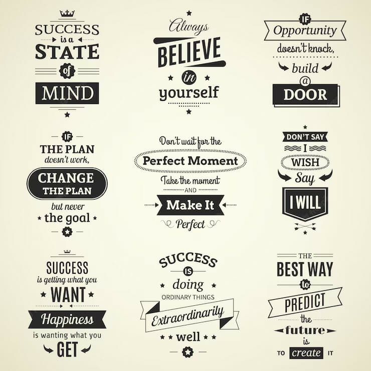
Most companies have particular typography that they use to help customers immediately identify them versus their competitors. With access to a larger selection of fonts, designers can easily express their brands through typography.
This is because your choice of typography can indicate hints about what your brand represents. Is your business fun or serious? Functional or informational?
You must also consider the font’s applicability across all browsers and computers. Choosing the wrong font that is not universally supported could mean that your website will display awkwardly on different devices.
9. Parallax zoom scrolling
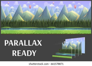
The parallax effect is an animation method wherein foreground elements of a website are made to move faster than the background elements. This creates a sense of depth and realistic movement that grabs the viewer’s attention. It has been amongst the most popular website design trends for a few years now, but websites in 2023 are specifically favoring parallax zoom scrolling.
Instead of scrolling horizontally or vertically, the parallax scroll takes visitors inward or outward from the horizon. And this creates a unique three-dimensional movement. Isn’t that creative?
This method counts on its immersive power and overstimulation of the viewer’s senses. And the result is a gripping experience that gets visitors interested. Here’s an example of parallax zoom scrolling-
10. 3D Elements And Immersion

Starting with 3D elements and parallax zoom effects, the trend of incorporating immersive 3D effects is evolving into fully rendered 3D worlds. These 3D effects are often accompanied by music and work wonders to engage viewers and keep them on the page.
After all, taking users on a journey through digital space with the smooth tracking of a movie camera with engrossing audio is sure to grab their attention!
However, this trend takes a great deal of effort to pull off as it involves complex 3D modeling and sound mixing. Moreover, such websites may be too complex and confusing for simple products and services that are centered around one call to action.
So, you need to judge your requirements and resources carefully before taking a dive into the 3D world. Simple 3D elements and parallax effects may be sufficient for now if you want to dip your toes into these waters!
Here’s an example of an immersive 3D website-
Summing Up
These were the top trends and elements in modern website design that you must consider adding to your website now! Of course, you can go for web design SaaS or AI web designers for some quick results. However, it is always preferable to contact an experienced website designing company like Infobrandz.
Contact us now to leverage the comprehensive expertise of our expert WordPress web designers instead of counting on limited individual skills or standardized AI creations. After all, your website is your brand’s face on the interest, and it creates the crucial first impression that you just cannot afford to compromise with!






0 Comments