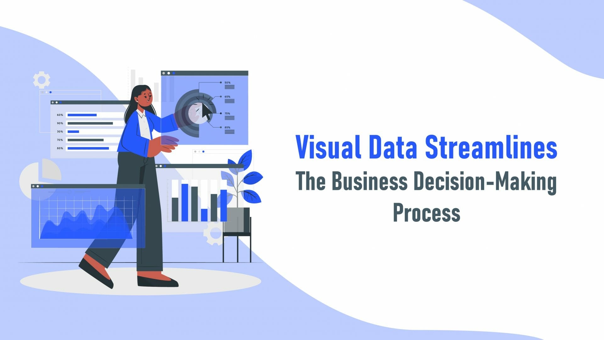
Visual data streamline refers to the process of organizing and presenting data in a way that is easy to understand and interpret through visual elements such as charts, graphs, and maps. This can include techniques like data visualization, data dashboarding, and data storytelling. The goal of visual data streamlining is to make complex data sets more accessible and actionable for users, helping them to identify patterns, trends, and insights more easily.
Data is a necessary component of all decisions regarding your business. Unfortunately, crunching numbers and sorting through facts and figures is a time-consuming process that can slow you down. Enter data visualization.
What Is Data Visualization?
Data visualization is the process of turning information into an “at-a-glance” document, image, or chart. You can see visualized data all over the place, such as in the custom infographics created by Infobrandz. Pie charts, maps, and timelines are examples of visualizing data that you are probably familiar with.
History Of Visualized Data
When you look at a meme or infographic on your phone or computer, it’s easy to think that the idea of conveying complex concepts through animations and imagery is an advent of the modern age. It’s not. In fact, the first form of data visualization dates back more than 8000 years to the first maps. You can find simplified data all throughout history, and it became more popular during the early 19th century. The Smithsonian Magazine showcases multiple instances of how data has been used historically to spread facts and clear up misinformation. Visualization has also been used on a broad scale to help governments decide where to expand.
It’s true that some people prefer to dive deep into data, dissect layers of information, and surround themselves with hard facts. 65% of the population disagrees. That’s the percentage of people that are considered visual learners, and graphic models and visualization tools are the keys to capturing this demographic’s interest. Visuals offer a way to convey information quickly and easily, and it gives those who need it a snapshot of insight that they can choose to dive deeper into or take at face value. Another crucial consideration if you are deciding to start using infographics and visual tools in your business: the human attention span is a mere eight seconds, according to Melbourne, Australia-based content service provider Rainieri & Co. This means you have less than the time it takes to pour a cup of coffee to capture someone’s attention.
Benefits To Your Business
Although you only have a moment to get your information across, visuals make it easier. Just as important, data visualization can assist you in making better decisions for your business. The data that you use within your business can be used for everything from marketing to risk mitigation. You might even use certain types of data, such as charts showing efficiency, to decide if, when, and how to implement new processes and procedures within your organization. Data visualization helps you more easily understand your customers, personalize your services, and makes sense of issues that plague your company.
Benefits To Your Customers
Visual data is not just beneficial for you as an entrepreneur; it’s also a huge perk for your customers. There are many reasons for this, but one is so that they can make more informed decisions much as you do for your business. Let’s look at it this way: your customers want to save money. They will compare your services/products to your competitors. If you can quickly and efficiently show them how your product will save them money, they may be more likely to patronize you. You can also use visual data tools to help your customers decide when to do certain things, where to move, or what service provider to choose based on their address. Visual data is also useful in building safer communities, and sites, like CrimeMapping.com, utilize interactive data visualization tools to ensure that people are more informed about the safety of their neighborhoods.
Types Of Visual Data Tools
While infographics are without a doubt one of the most popular visual data tools out there, there are many ways to transform your data into something easier to understand. These include:
- Charts are great tools that help you compare and contrast. Some of the most common types of charts include a pie, bar, column, and line. Each of these can be used to share the same types of information, and it is up to you which makes the most sense for your business.
- Tables share information that isn’t quite as easy to chart. A table might, for example, give you a quick glimpse at pricing for life insurance by age.
- We’re all familiar with maps, but did you know how you can use them in your business? For starters, maps can easily show you the political makeup of your area, income disbursement, and even the distance between your location and popular tourist destinations that might help you bring customers to your door.
- A dashboard is essentially a control center that allows you to access different data points, tasks, or summaries of things like your website or social media. These digital tools are rightly named after the dashboard on your car, which shows you how fast you are going, if your battery is charged, and if your vehicle is at risk of overheating.
Data Visualization And Your Website
If you are interested in using data visualization tools for your website, great. You’ll reap many rewards, and your customers will thank you. But, where do you begin? If you don’t have a lot of experience, you can always order an infographic from Infobrandz or use the software you already have access to, such as Microsoft Excel, to create simple charts and graphs. These images can easily be pulled into your website so that your customers can view them on their devices or computers.
Data visualization has been around as long as the written word. Today, businesses can utilize things like infographics, charts, and interactive maps, to make better decisions and to provide information to their customers so that they can do the same. In a world where attention spans continue to get shorter and shorter, anything you can do as a business owner to capture and captivate your audience is a step toward success.
Does your data need a digital makeover? Infobrandz has you covered with custom infographics that help you get your message across to your clients, customers, and employees!








0 Comments