With their superior reader engagement, improved conversions, and 12% boost in website traffic, the importance of infographics and the opportunity they offer are undeniable. But big opportunities come with big competition!
Nearly 60% of marketers have already started using infographics to outshine their competitors, and you need to become the best in the business to make your place at the top! So, we’ll help you begin by addressing the key question- How to make an infographic that engages and converts the target audience?
How To Make An Infographic: The 5 Steps
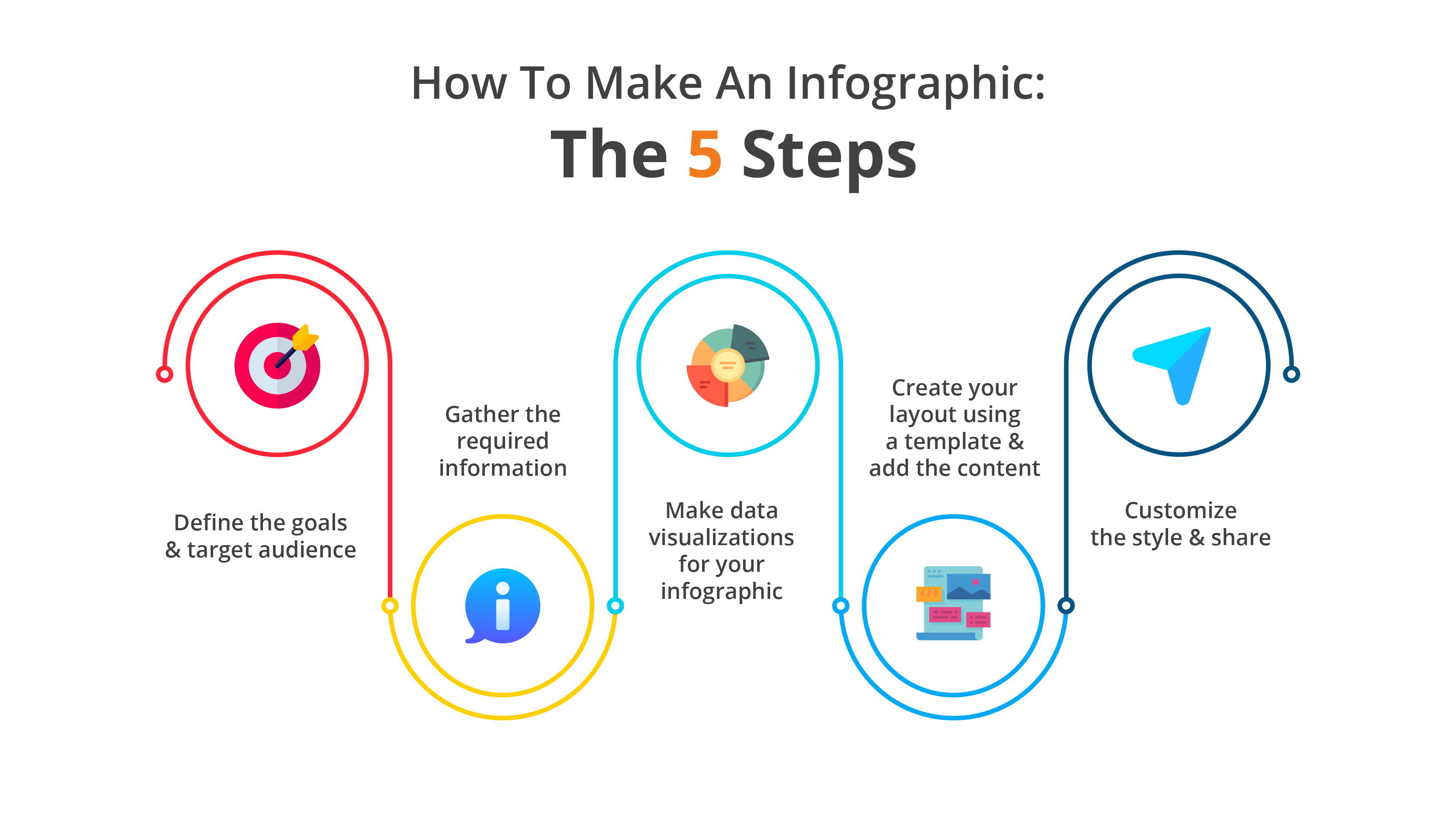
84% of marketers say they have used infographics successfully, and you can join them easily! Here are the five simple steps to help you build a breathtaking infographic that is customized for your purpose and audience-
1. Define the goals and target audience
You must start by setting the overall goals you wish to achieve through the infographic. Typically, an infographic acts as a visual communication aid that you can use to:
- -Create a quick overview of a topic
- -Summarize a long article or report
- -Simplify and explain a complex process
- -Compare and contrast different options to make a choice
- -Raise awareness about an important issue
- -Display research findings in a brief and interesting way
- -Raise traffic and conversions while lowering bounce rates
Moreover, you need to define the target audience of the infographic through market research and analysis of your own product or service. Consider their knowledge level, awareness, interests, needs, and choices to understand how to approach them.
Once you know why and for who the infographic is being made, you can use this knowledge as a basis for every infographics design step. Always focus on these two factors while setting the color scheme, tone, visual type, and overall style.
2. Gather the required information
An infographic is only as good as the quality of information you put into it! Accurate, relevant, and up-to-date information will make it valuable, while any errors in the facts or numbers can harm your brand’s impression. So, you need to focus on gathering the latest information from authentic sources.
You can either use data from your own research (such as interviews or surveys in the considered population) or go for secondary research by consulting online and offline sources. Generally, you can find a lot of data on the internet through targeted Google searches and research repositories like US Census Data, Statista, NHS, Kaggle, Google Trends, Google Scholar, and Data Plural.
Make sure to keep records and also note the key points you want in your graphic. These notes will help you decide on the infographic’s layout before actually adding text.
3. Make data visualizations for your infographic
Now that you know what to present and why it is needed, you can easily decide how to present that data visually. To decide which visualization is right for your infographic, start by defining the specific goal. Then, consider the type of data and check your visualization options to find the best match.
Once you decide which charts to use, you can use any good infographics design tool like Canva or Adobe Creative to create them. Such tools are typically easy to use and offer tutorial videos if you have any doubts.
To help you choose and design the correct visualization, here are the possible specific goals and their respective visualization charts-
- Inform- Use a simple drawing that highlights the important message or statistic by making it stand out in the design.
- Relationship- You can use a scatter plot or multi-series plot to reveal complex relationships among data entities.
- Change- You can show trends over time or space or both using a line chart, timeline, choropleth map, or map series.
- Organize- You can also show groups, ranks, patterns, or orders using a list, table, process flowchart, and boxes to show groups. You can also show a rank or order using a bar chart, bubble chart, column chart, or pyramid chart.
- Explore- To make a visual that lets the reader explore and gain insights themselves, you can use interactive charts that allow for filtering, sorting, and discovery. However, these graphs are time-taking and costly to make.
- Compare- You can draw parallels and comparisons between multiple data sets or parts of a whole by using the right chart. A bar chart, bubble graph, and column chart are typically used to draw parallels. Parts of a whole are compared using a pie chart, donut chart, pictograph, treemap, stacked bar chart, stacked column chart, or stacked area chart, etc.
4. Create your layout using a template and add the content
You can now start by selecting a good template and symmetric grid that allows you to place the planned elements and visualizations properly. Using an infographic design tool, create the layout and flow of information based on the template and important points you had planned to cover.
Also, add an eye-catching heading that tells your reader what they will get by reading your infographic. Next, you can fill the layout with concise text content, visualization charts, backgrounds, images, and relevant visuals. But don’t finalize the graphic yet!
You now need to customize it to match the theme, target audience, and goals. This takes us to the next step.
5. Customize the style and share
You need to add a customized style to your infographic design to get it in line with its goals and audience. So, you need to adjust the template’s colors, fonts, text, and images to match your target audience, topic theme, and goals perfectly.
Next, you can proofread the infographic to remove any design or grammatical errors and double-check the facts and statistics added to it. Then, you can export the infographic and share it on social media, embed it on your website or blog, or send it via email. Let us now see some tips to help you optimize the content and style when you create infographics.
Tips to make the best infographics
We have now covered the basics of how to create infographics, but an ordinary graphic will not impress its target audience. So, the next question is- How to make an infographic that stands out from the rest to captivate and convert the audience? Here are the top 10 tips to help you create a visually compelling, informative, and engaging infographic-
- Use a catchy title: The title is the hook that must catch your audience’s attention! So, start with a short and interesting title that attracts your audience’s attention and defines what your infographic is about in brief.
- Keep the goal in mind: Think about what you want your infographic to accomplish and make sure its design and shared data serve that purpose. You need to define your unique goals and adjust the structure, color scheme, and content accordingly.
- Keep the design simple: Too much clutter can confuse your audience and distract them from the message you want to convey. Stick with a few appropriate fonts, and limit the amount of text and graphic elements to make sure your infographic is true to its purpose.
- Adjust the structure based on the purpose: A centered, single-column design layout is suitable for content with a linear flow, while a two-column design layout is good for making comparisons, and an aesthetic multi-section layout is appropriate when order is not important.
- Get the correct data: Quality data is essential to creating an infographic, and any factual or statistical errors can destroy your impression! So, make sure all numbers and facts added are accurate and up-to-date while writing the content for your infographic.
- Use attractive visuals: Use interesting visuals wherever appropriate but remember to keep the focus on the data while using the images as support. Also, make sure the images are relevant, professional, and used only where suitable.
- Tell a story: Use the information and relatable visuals to create a narrative that follows a logical progression. This will build a story that keeps the viewer engaged and itching for more!
- Include a call to action: Make sure to include a relevant call to action with social links at the end of the infographic to reap the results of your design efforts. A compelling CTA will help improve conversions by guiding and encouraging the viewer to take actions such as visiting a website, sharing the infographic, registering an account, or downloading a resource.
- Work on the Aesthetics: Choose a color scheme, structure, and typography that are easily understandable and complement each other. The combination of charts, colors, and text should reflect your brand’s voice and creativity.
- Follow the rules: Always adhere to copyright laws and the rules of the discussion forum, social media, or blog site on which you publish the infographic.
Conclusion
Now that you know how to make an infographic easily, you can go ahead and create impressive infographics within just a few hours! You can export it in the convenient image format or use a PDF format if you have added links.
If you still feel you would rather go for an expert who has vast experience, you can go for Infobrandz, which is one of the most reputed infographic design agencies that offer premium graphics affordably. All the best!








0 Comments